- News
ULS presents institutional logo
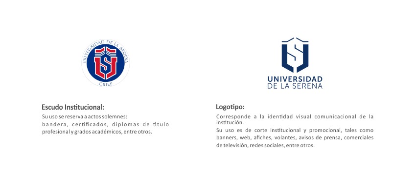
The new graphic form of communication of the University comes to complement the traditional Institutional Shield that will be used in solemn communication contexts.
The University of La Serena chose social digital environments to launch a new visual image for its institutional and promotional communications. It is an isotype that rescues the elements of the original institutional Shield -which is part of the tradition of the house of studies- and that seeks to improve the visibility and recognition of the name of the University in small format formats.
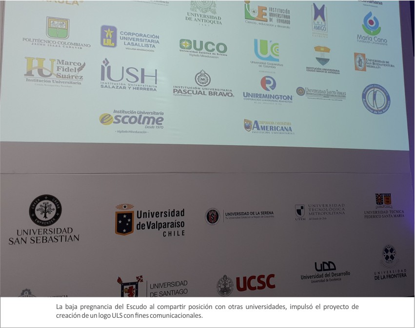
“The ULS began an exercise to review the use of its Shield, observing that when it was used in the context of mass communication, the name of the institution lost notoriety. This happened because the Shield was used and adapted as if it were a logo, without the necessary safeguards. Thus, to the sophisticated original construction work of the Shield, elements such as circles, words and phrases were added, forcing it to become a logo and slogan," explains Carola Espinoza Orellana, a professional who joined the ULS last March within the framework of the project to create the Strategic Communication Department, a new unit that will manage the communications of the corporate brand in order to increase its reputation.
In this way, to respect the solemn use of the Coat of Arms created in 1981, it will be ensured that this important symbol is used in solemn acts and documents, such as titles and degrees, certificates, theses, etc.
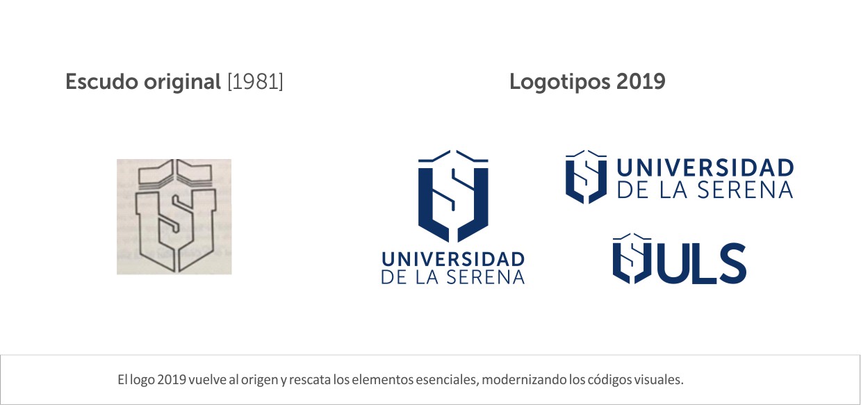
“The challenge was to rescue the central elements from the original 1981 Shield and bring them to modern graphic styles that are compatible with smaller format digital formats. For this reason, in addition to the logo in vertical and horizontal application, we created one with the acronym ULS, whose use will be applied in social networks, smaller digital formats, clothing and small corporate articles”, explains the Master in Communication, in Management of Marketing and Direct and Digital Marketing, Carola Espinoza.
On social networks, criticism did not take long to arrive, especially from those who thought that the logo replaced the Shield. Before them, the Director of Strategic Communication points out that the opinions are valid and that they hope that once the community understands that the logo does not replace the traditional Shield, but rather accompanies it, acceptance will improve.
“It is a good sign that a community defends its identity. The important thing is to understand that the essence does not change, but its forms of expression must evolve. It would have been strange if everyone applauded the measure. Furthermore, since some believed that we had eliminated the Shield, the criticism is understandable. For now, what must attract us all is for ULS to be easily recognized in the national context, which is where our image is less known. The logo and the communication isotype come to help us in this task of being seen, while the stories and content that we are generating must fill that visuality with meaning,” the professional points out.
The visual identity project is one of the first innovations of the new ULS era in terms of strategic communication, a discipline with which it hopes to reinforce a relevant personality and voice in the face of its community of officials, students and the regional, national and international social environment. .
"We are preparing to reach 40 years of institutional life with a brand that, based on its heritage and tradition, is willing to innovate to walk together with its Region, in the challenges imposed by the XNUMXst century," says Espinoza.